How Pantone's Colour of the Year Shapes Packaging Design
The Evolution of Pantone's Colour of the Year in Packaging
The Pantone Colour Institute has been setting global colour trends since 2000, profoundly influencing fashion and interior design and revolutionising the packaging industry. Each year's colour selection sends ripples through the packaging design world, affecting everything from luxury boxes to shipping labels, retail packaging and promotional materials.
Understanding Pantone's Selection Process
Each year's colour selection involves extensive research across industries, with packaging trends playing an increasingly important role. Pantone's experts analyse emerging packaging innovations, sustainable materials, and consumer preferences in unboxing experiences. This comprehensive approach ensures that each chosen colour captures cultural moments and performs effectively in various printing and packaging applications.
Impact on Packaging and Label Design
When Pantone announces its Colour of the Year, packaging designers and brands begin incorporating these hues in innovative ways:
Primary packaging designs
Secondary packaging elements
Shipping materials and unboxing experiences
Label designs and brand identifiers
Limited edition packaging collections
Seasonal promotional materials
The influence extends beyond mere colour application – it shapes entire brand experiences through packaging choices.
The Psychology of Colour in Packaging
Colour psychology is crucial in packaging design, influencing consumer perceptions and purchasing decisions. Each Pantone colour of the Year brings its psychological impact:
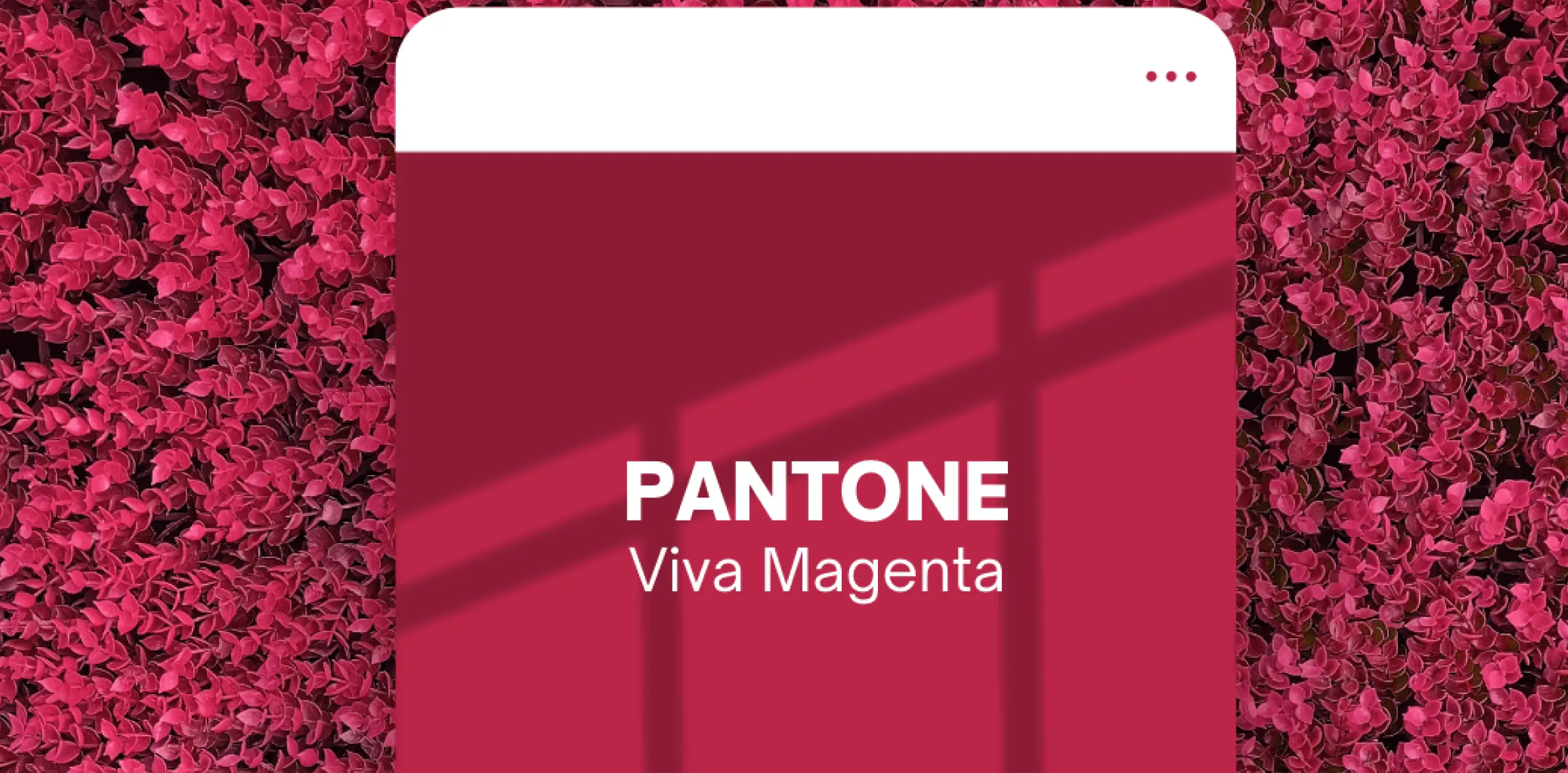
2023: Viva Magenta (PANTONE 18-1750)
In packaging, Viva Magenta represented boldness and vitality. Brands utilised this crimson-red shade to create striking packaging that commanded attention on shelves and in digital marketplaces. The colour's association with strength and optimism made it particularly effective for premium product packaging and luxury unboxing experiences.
2024: Peach Fuzz (PANTONE 13-1023)
This year's selection brings a softer approach to packaging design. Peach Fuzz offers a cosy, tender touch that resonates with consumers seeking comfort and connection. In packaging applications, this gentle hue creates:
Welcoming unboxing experiences
Approachable luxury packaging
Emotionally engaging label designs
Harmonious colour combinations for brand packaging systems
Brands already incorporate this warm, embracing tone into their packaging strategies, creating contemporary and comforting designs.
Notable colour Selections and Their Packaging Impact
Historical Perspective
2000's Cerulean: Introduced calming blue tones to packaging
2016's Rose Quartz and Serenity: Pioneered dual-tone packaging approaches
2021's Ultimate Gray and Illuminating: Demonstrated contrast in packaging design
2023's Viva Magenta: Bold packaging statements and digital integration
Current Trends with Peach Fuzz
The 2024 selection is particularly significant for packaging design, representing a shift toward:
More emotionally resonant packaging experiences
Sustainable packaging materials that complement natural tones
Inclusive design approaches in product packaging
Integration of digital and physical brand experiences
Looking Ahead: Packaging Trends for 2025
As the packaging industry embraces 2024's Peach Fuzz (PANTONE 13-1023), the design community is already anticipating 2025's colour revelation. This annual tradition of colour forecasting has become particularly crucial for packaging designers and brands planning their long-term strategies. Each year's colour selection offers fresh insights into global trends, cultural shifts, and collective moods – insights invaluable for creating packaging that resonates with tomorrow's consumers.
Some industry experts are predicting a shift towards colours that reflect our increasing focus on environmental consciousness and technological integration. Others suggest that the post-Peach Fuzz era might embrace dramatic hues celebrating human resilience and creativity. Regardless of the colour chosen, its impact will ripple through every aspect of packaging design – from luxury boxes to shipping materials, from label designs to complete unboxing experiences.
Viva Magenta Project's Approach to Colour Trends
Our commitment to innovative packaging solutions directly aligns with Pantone's colour traditions. We help brands integrate each year's colour selection into their packaging strategies through:
Custom packaging design services
Colour-accurate printing solutions
Strategic brand colour implementation

