Choosing the Right Color System for Your Package Design: CMYK or Pantone
Understanding Color Systems in Modern Package Design
In the world of packaging and label design, colour accuracy isn't just about aesthetics but brand identity and consumer recognition. The choice between CMYK and Pantone colour systems can significantly impact your packaging's final appearance, production costs, and brand consistency. This decision becomes even more crucial when designing labels, boxes, or branded packaging materials that need to stand out on the shelf.
What's the Difference Between CMYK and Pantone Colors?
CMYK printing, often called four-colour process printing, creates colours by combining Cyan, Magenta, Yellow, and Key (Black) inks in various percentages. It works much like mixing paints to achieve different colours. When you see stunning product photographs on packaging or intricate gradient designs on labels, you're likely looking at CMYK printing in action.
By contrast, Pantone colours are pre-mixed inks created to exact specifications—think of them as custom-mixed paint colours that remain consistent no matter where or when you use them. Each Pantone colour has a unique number, ensuring that your brand's signature blue or distinctive red looks the same across all packaging materials.
When to Choose CMYK for Your Packaging
CMYK printing excels when your packaging design includes photographs, complex gradients, or multiple colour variations. This system is particularly cost-effective for designs requiring a broad spectrum of colours. Product packaging featuring lifestyle images, food photography, or intricate patterns typically benefits from CMYK's versatility and reasonable cost structure.
The process works exceptionally well for digital printing, making it ideal for smaller production runs or test markets. Many brands start with CMYK printing when launching new products or testing package designs, as it offers flexibility without requiring a significant upfront investment in custom inks.
Why Consider Pantone for Your Package Design?
Brand consistency drives many companies toward Pantone colours. When your brand's recognition depends on a specific shade of red, blue, or any other colour, Pantone provides the consistency needed across different materials and production runs. This system particularly shines when printing on speciality materials or requiring special effects like fluorescents that CMYK cannot reproduce.
Luxury brands, established product lines, and companies with strict brand guidelines often justify Pantone's higher costs through the perfect colour matching it provides. Whether printing on cardboard, plastic, or adhesive labels, a Pantone colour maintains its exact shade, ensuring brand recognition across all packaging elements.
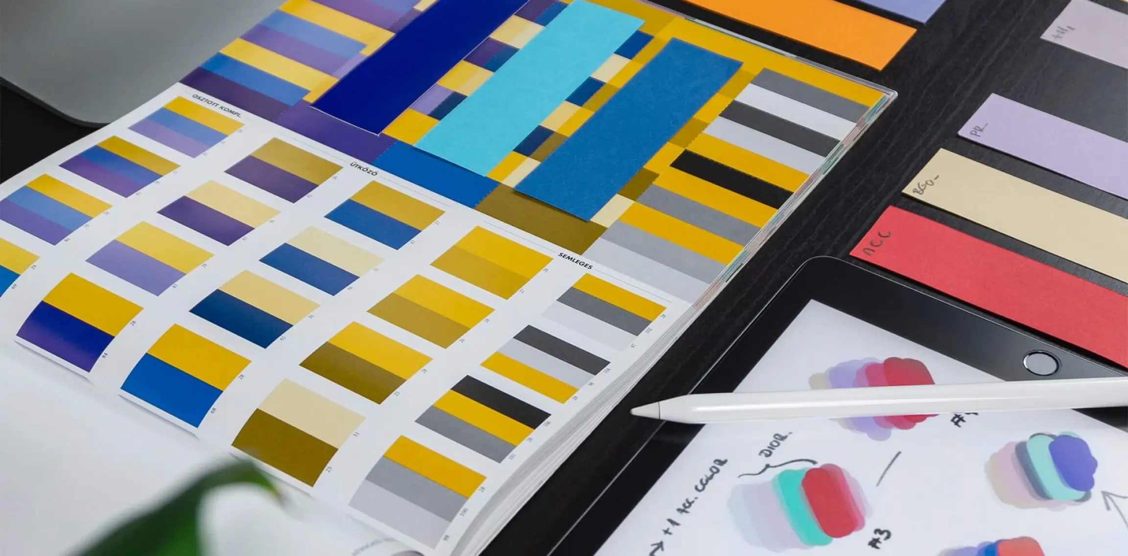
The Reality of Color Matching Between Systems
Converting colours between CMYK and Pantone requires careful consideration. While design software can translate Pantone colours into CMYK values, some colour shifts are inevitable. Professional designers and printing service providers use physical colour bridge guides to find the closest matches. This is significant when budget constraints require using CMYK to match established Pantone brand colours.
The most successful packaging designs often combine both systems strategically. For instance, Pantone colours can be used for logos and brand elements, while CMYK can be employed to support imagery and design elements. This approach balances cost considerations with brand consistency requirements.
Making Your Final Decision
When choosing between CMYK and Pantone for your packaging design, consider these key factors:
Production volume plays a crucial role in cost considerations. While Pantone colours require higher setup costs, they become more cost-effective in larger print runs. CMYK proves more economical for smaller runs and provides greater flexibility for design changes.
Brand requirements often dictate colour system choice. Pantone colours offer the consistency you need if your brand guidelines specify exact colour matches across all materials. For designs focusing more on photographic elements or requiring frequent updates, CMYK provides the versatility to achieve your goals efficiently.
Expert Guidance for Your Package Printing
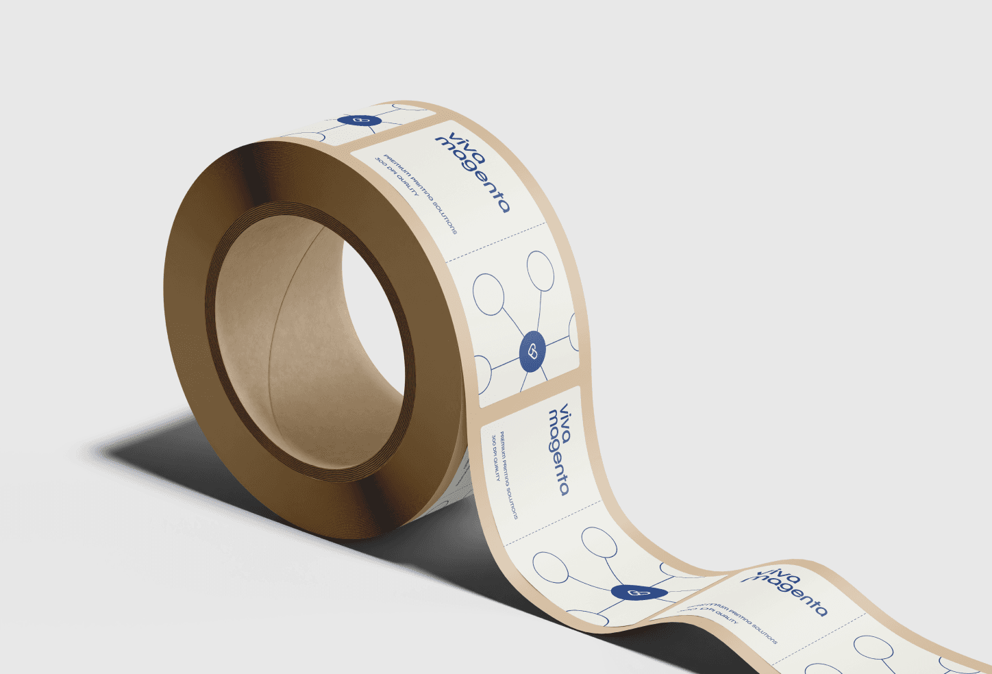
At Viva Magenta Project, we understand that choosing between colour systems impacts your brand's appearance and budget. Our team can help evaluate your specific needs and recommend the most appropriate colour system for your packaging design. We'll consider your brand requirements, production volume, and material choices to ensure your packaging balances visual impact and practical functionality.
Ready to discuss your packaging colour needs? Contact our team to explore how we can help bring your brand's packaging vision to life with the right colour system.